Filed under: Design Process, Design Theory, Graphic Design, Marketing & Sales, Strategic Design
 The greatest challenges an agency like X faces come directly from the nature of its clients. Having chosen to exclusively work with international institutions and organisations, NGOs, the academic and cultural sector there are quite a few obstacles, challenges and trade-offs needing to be met and faced. Although it may seem as if the clientele is fairly uniform and the needs would be a pattern on which to perform, the case is not quite the walk in the park…
One of the challenges X is called to face is the nature of each institution and its unique character. Aspects such as hierarchies, bureaucracy, workflow and types of projects are different from organisation to organisation. Each one has its own procedures of dealing with their needs, with publishing public tenders and outsourcing. Here, tenders and procurements are key words which define the very nature of this challenge. Continue reading
Filed under: Design Process, Graphic Design, Strategic Design | Tags: Design Process, Graphic Design, graphic identity, organisation, presentation, re-branding, tasks, value, visual communication
 I am currently working for a design company whose clientele comprises only of international organisations, institutions, NGOs, the education sector etc. They have offices all around the world and clients from New York to Mumbai. With an experience of 20 years, various partnerships with printing houses, external graphic studios etc. they provide all kinds of services based on graphic material, from the design and the campaign to translation and delivery anywhere in the world. Apart from the fact that they are in an advanced position given their market segment as a definition, they have also done a very smart thing: Since their clientele is sensitive to such matters, they made sure to get as many corresponding certifications, for example they have three ISO, an international certification for labour rights and are now about to receive their third for low CO2 emissions. They asked me to provide them with a new identity pack, a new identity approach and consult them regarding their stationary and generally their presentation graphic material. Continue reading
Filed under: Design Theory, Industrial Design | Tags: Design Theory, evolution, Industrial Design, lecture, sofa, studies, visual communication
 During another lecture in Aalborg University, a professor explained to us something that I would like to use for future reference and why not, if I ever become part of the education core, I would like to teach pupils too. She demonstrated the transition of the sofa, couch and coffee table ensemble from a mere “sitting room” in the 60s and 70s to the “living room” it is today. Alright, picture this: for those who are old enough, we all remember our grandma’s or aunts’ living room. How the sofa was either a double or tripple-seat and always the sofa was long, how the coffee table would find itself placed right across from the sofa with two armchairs on each side of the coffee table, leaft and right, right? I will not even mention the cheesy tapestry of the 60s and 70s. Continue reading
Filed under: Design Theory, Graphic Design | Tags: complex, design, paradox, random thoughts, simple, visual cognition, visual communication, visual sign
 This is going to be one of the few times the picture I post actually has something, even everything to do with the text. Take the word “simple” and write it in a complex way, as can be seen in the picture to the left. What is the visual significance of this? Does this signify that it is simple to make something complex? That it is quite easy to create something that looks kooky? Or does it mock the word “simple”? Does it immediately take away the meaning of the word, placing more weight to the complex composition of the image, therefore giving an ironic tone to the image-word ensemble?
Filed under: Uncategorized | Tags: beard, head scarf, oppression, random thoughts, religion, visual communication, visual signs, western standards
 I was in West Ham today and I remembered something I had thought about some time ago… I found it very interesting that in Europe and the US (generally in the Western world) there is an outcry about muslim women “being forced” to wear the head-scarf. Whether that is their choice or not, doesn’t matter really, because the good and civilised West knows that these women have been brain washed and culturally oppressed by their religion. I am fine with all that, no judgment so far, this is not the point I would like to make anyway.
What I am thinking, and maybe it is totally pointless and silly to even discuss it, is the fact that no one seems to comment on the corresponding oppression the more religious muslim men have. They have to take care of it, the beard is a symbol of their level of faith and it is a visual sign which communicates to the people around them which god they believe in. Continue reading
Filed under: Uncategorized | Tags: schedule, summertime, the semantic turn, workload
 Back in Greece with a Master’s degree in my hand and I thought I would look for a job during those two months. I forgot how coordinated the Greeks are when it comes to their holidays. Everything is paralised during the first twenty days of August. So, after having spent half an hour in an interview only to find out that I was to be hired from the 25th of August and having sent seven resumes to advertising and publishing companies here and there, I have decided to relax, sit back and enjoy the summer in another way: I will work on learning SolidWorks, preparing my presentation for the second part of the Aarhus seminar, studying for the GRE and writing my state of purpose for the applications to Universities… Since I will be in Athens, with only a couple of days every now and then for swimming and sun-bathing I might as well work. I will be reading The Semantic Turn: A New Foundation for Design by Klaus Krippendorf and at the end I will also write a review.
Just keeping myself busy as much as I can.
Go’ sommer.
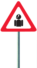
 One of the most astonishing and long established visual signs are, of course, road signs. Using the simplest shapes, colours, images and enhancing their materials to suit contemporary cars’ high beams and generally car lights, road signs all over the world are the most common visually communicating symbols used. Some have typestting and others do not, yet everyone, even old grannies and grandads, know how to read “STOP” when they see them. I tried (and I will admit, I did not go too far) to find the history of road signs on the net and I was only able to come up with the
  Some time ago, I participated in a seminar on
  Now that I have finished with the thesis, the presentation and I am almost done with the poster, I have some time to think, reflect on what just happened. What did I learn, what did I do, if it was worth it, if something meaningful came out of it etc. Am I talking out of my arse? Am I in danger of losing the substance by looking through a microscope into something meaningless? Did I even set the basis for this “very important” co-production that I promised I would do? While all things are happening in this world, am I caught in this useless field that has nothing to offer to anyone apart from its actors, the design-obsessed world? I really hope not…
Filed under: Politics | Tags: behavior, behaviour, comment, commentary, culture analysis, female, fury, ilektra, individualism, macho, male, mandragou, misogynism, response, Scott Adams, semiotics, society